
Proof Options
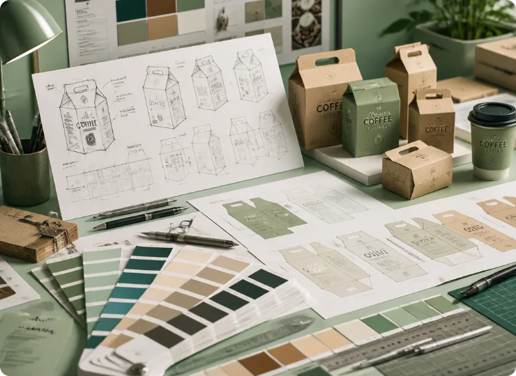
Color proofing station — Pantone fan deck, spectrophotometer, loupe and calibration strips


Hot & Cold Thermal Bags, Insulated Mailers & Cold Chain Delivery Packaging

Fertilizer, Pesticide & Agrochemical Packaging

Cleaner, Laundry & Air Care Packaging

Custom Medical Packaging Solutions

Protective Structures, Inserts and Retail Packs

Custom Protein Powder Pouches, Vitamin Stick Packs & Nutrition Bar Bags

Cosmetics, Fragrance and Skincare Packaging

Takeout, Bakery and Beverage Packaging

Kibble, treat & wet food packaging
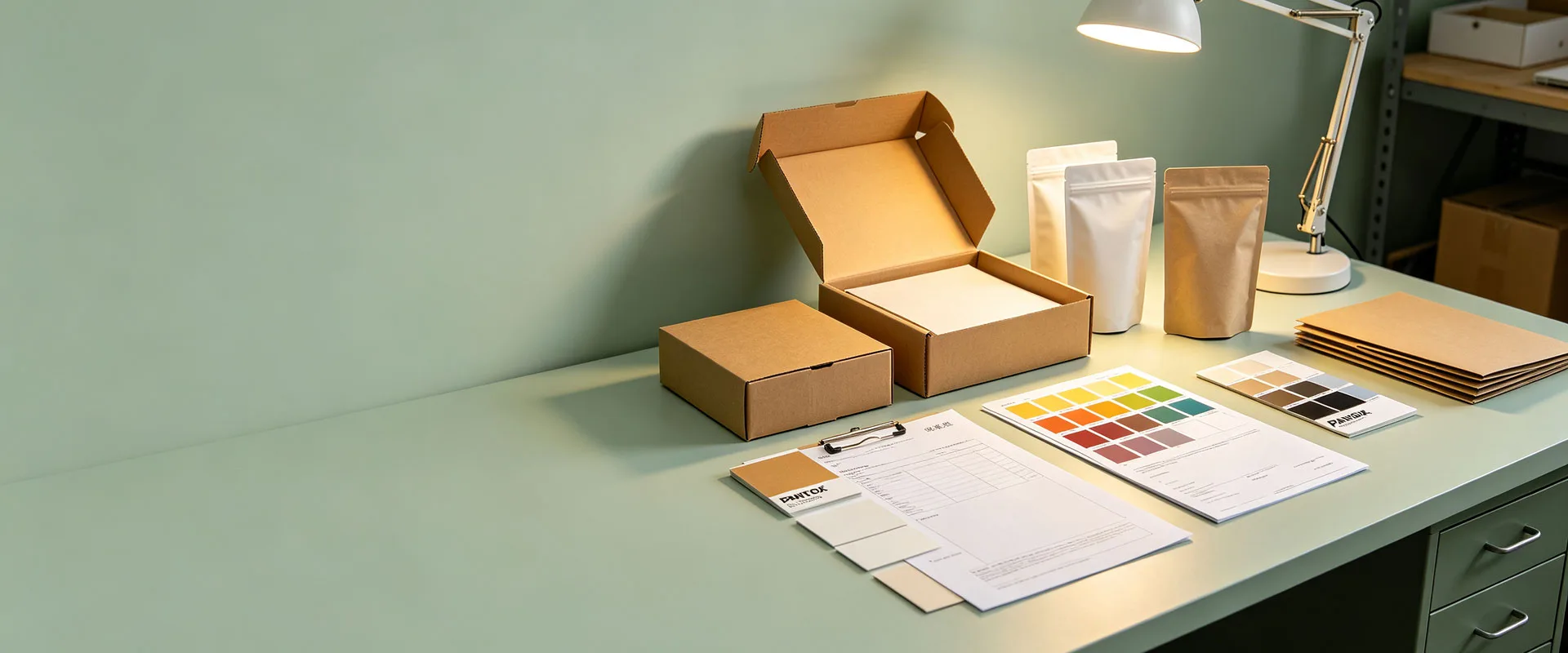
Choose the color system, film base, white ink and proof method together. This gives your team a clear production reference instead of judging color from different screens.
Six figures are embedded within this document. The table below details the placement of each individual image, together with brief descriptions of their corresponding illustrated content.
Color proofing station — Pantone fan deck, spectrophotometer, loupe and calibration strips
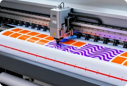
Gravure cylinder, doctor blade and ink fountain printing CMY bars on film
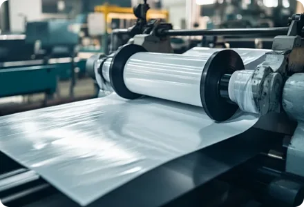
Five film bases — clear, white, foil, metallized, kraft
Layered structure — outer film, white ink layer, printed layer
Same pattern under matte vs gloss lamination
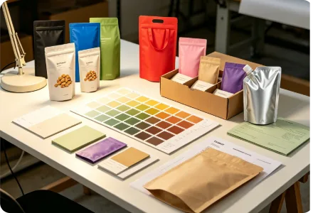
Nine blank pouches in nine color directions
Go directly to the color decision you need to make. The practical route depends on your artwork, film base, finish, quantity and how closely a brand color must be controlled.
A screen preview is not a print standard. RGB screens create color with light; packaging uses ink reflected from a translucent film, so the film base, coating and lighting all change the result.
For a critical color, approve an agreed physical reference or production-relevant proof — not a screenshot sent through email or messaging apps.
| Route | Best suited to | Main strength | What you need to confirm |
| 12-color gravure | High-saturation brand solids, fine gradients, metallic/pearl inks, long runs | Deep ink laydown, stable color over large batches | Cylinder engraving cost, minimum run length, ink system |
| 8-color flexo | Water-based inks, quick changeovers, medium runs | Lower plate cost, faster sampling, food-safe solvent-free options | Ink coverage limits, fine-screen gradients, dot gain on film |
| Gravure + flexo hybrid | Different jobs sharing one supply chain | Each job uses the process that fits its color demand | Color consistency between the two processes on repeat orders |
Ask which process will run your job before approving artwork — dot gain, ink laydown and gradient rendering differ between gravure and flexo.
| Color route | Best suited to | Main strength | What you need to confirm |
| CMYK | Photography, gradients, multi-color graphics | Flexible full-color reproduction | Gamut, black build and proof route |
| Spot color | Logos and critical solid brand colors | A specified ink reference on the real film | Film base, white ink, finish and tolerance |
| CMYK + spot | Rich graphics plus a controlled brand color | Image flexibility plus one defined reference | Extra cylinder/plate cost and final specification |
Ask which process will run your job before approving artwork — dot gain, ink laydown and gradient rendering differ between gravure and flexo.
| Film base | Color behavior | Design note |
| Clear PET/PE | Light passes through; content shows through | White ink underprint needed for bright solids |
| White film | Clean base for bright process color | First choice for saturated brand colors |
| Aluminum foil (PET/AL/PE) | Metallic reflection shifts and darkens colors | Use opaque white base or selective white for logo areas |
| Metallized film (VMPET) | Semi-metallic sheen, lighter than foil | Metallic look with partial transparency control |
| Matte or pearl film | Reduces saturation, adds soft texture | Approve critical colors on the actual matte surface |
| Kraft-laminated film (extension) | Brown base shows through many inks | White underprint or a different base may be recommended |
Ask which process will run your job before approving artwork — dot gain, ink laydown and gradient rendering differ between gravure and flexo.
Gloss, matte and soft-touch films change contrast, depth and perceived saturation. Approve critical color with the planned finish — the same ink can look different under a matte film.
Softens contrast, slightly reduces perceived saturation
Deepens contrast and gloss, colors look more vivid
Adds a raised glossy accent on selected areas
Metallic accents that cannot be reproduced by process ink
Texture changes how light hits the surface
| Step | Action | Purpose |
| 01 | Share reference — Pantone code, approved sample or agreed measurable standard | Define the target color objectively |
| 02 | Lock the film base — substrate, thickness and printing side | Eliminate material variables |
| 03 | Select the print route — gravure/flexo, CMYK/spot, white ink | Match process to artwork demand |
| 04 | Choose the proof — from digital proof to production-grade sample | Match proof cost to color importance |
| 05 | Approve under standard lighting — D65 daylight booth | Judge color under a fixed light source |
| 06 | Record the target — keep the approved sample with the job specification | Anchor repeat orders to one reference |
Ecopak provides Pantone-matched proofs in 3-5 working days before mass production, so critical colors are locked before the cylinder or plate is engraved.
| Proof | Useful for | Important limitation |
| On-screen PDF | Text, layout and content approval | Not a physical color standard |
| Digital printed proof | Artwork position and indicative appearance | May not reproduce final gravure ink exactly |
| Film & material swatch | Base transparency, whiteness and surface | Does not show the complete printed artwork |
| Production-grade sample | Final film, ink, white and finish relationship | Requires more setup, time and cost |
Ecopak provides Pantone-matched proofs in 3-5 working days before mass production, so critical colors are locked before the cylinder or plate is engraved.
| Color direction | Typical film & ink combination | Look |
| White | White film or clear film + white underprint | Clean, bright, minimal |
| Black | White film + dense black build | Strong contrast, premium feel |
| Blue | White film + spot blue or CMYK | Brand-stable, easy to match |
| Green | White film + spot green | Fresh, natural positioning |
| Red | White film + dense red or spot red | High shelf impact |
| Pink | White film + pastel build | Soft, cosmetic-friendly |
| Purple | White film + spot purple | Luxury, specialty segments |
| Kraft (extension) | Kraft-laminated film, white underprint optional | Natural, earthy tone |
| Metallic accent | Foil or metallized film + selective white | Premium metal highlights |
Ecopak provides Pantone-matched proofs in 3-5 working days before mass production, so critical colors are locked before the cylinder or plate is engraved.

INQUIRY